Team
5 UX Designers
Role
UX Designer
Time Stamp
August 2023 - December 2023

RENT A VEHICLE
Project
Project
UX Research, UX Design
Team
5 UX Researchers
Role
UX Researcher
Time Stamp
January 2023 - May 2023
H
H
ow user research and task analysis led to the redesign of a car rental website, improving usability and streamlining the booking process for diverse user needs?
ow user research and task analysis led to the redesign of a car rental website, improving usability and streamlining the booking process for diverse user needs?
ow conducting a usability study on a Medicare Part D Welcome Packet identified key usability issues, resulting in actionable recommendations that enhanced the user experience?

Summary
Summary
Summary
The "Rent-a-Vehicle" project aimed to enhance the user experience of car rental websites by addressing issues faced by tourists, house movers, and individuals with driver’s licenses but no personal vehicles. Through user research and task analysis, we identified key pain points, such as difficulty comparing prices and hidden fees, and designed new features including a centralized review system, a comparison tool for prices and features, and an optimized search function for nearby rental locations. These features streamlined the booking process, improved usability, and promoted transparency, ultimately providing users with a more intuitive and efficient car rental experience. This case study highlights the value of user-centered design in addressing user pain points and delivering impactful solutions.
The "Rent-a-Vehicle" project aimed to enhance the user experience of car rental websites by addressing issues faced by tourists, house movers, and individuals with driver’s licenses but no personal vehicles. Through user research and task analysis, we identified key pain points, such as difficulty comparing prices and hidden fees, and designed new features including a centralized review system, a comparison tool for prices and features, and an optimized search function for nearby rental locations. These features streamlined the booking process, improved usability, and promoted transparency, ultimately providing users with a more intuitive and efficient car rental experience. This case study highlights the value of user-centered design in addressing user pain points and delivering impactful solutions.
Tools And Techniques Used
Description 1
Tools And Techniques Used

User Interviews
Conducted to gather insights into user behaviors, preferences, and pain points.
Heuristic Evaluation Applied Nielsen’s 10 heuristics to assess the packet's design and identify usability issues.
Contextual Inquiries
Observed and interviewed users in their natural environment to understand real-world rental experiences.
Usability Testing
Conducted usability testing with 7 participants to validate the identified issues and gather actionable feedback.
Affinity Diagramming
Organized and categorized research findings to identify key themes and pain points.
Affinity Diagramming
Organized and categorized research findings to identify key themes and pain points.
Figma
Used for wireframing, prototyping, and collaborative design.
Task Analysis
Focused on identifying key tasks and ensuring they were aligned with user needs and expectations.

Flow, Sequence, and Consolidated Sequence Models
Created to visualize user interactions, decision points, and the overall journey in the booking process.
Participant Feedback
Collected feedback from participants through surveys to assess user satisfaction and usability.

Vision Diagram
Developed to represent the overall design vision and align team goals with user needs.
Vision Diagram
Developed to represent the overall design vision and align team goals with user needs.
What I Did?
What I Did?
What I Did?
As a UX Designer/Researcher, I collaborated with a team of designers and researchers to conduct user interviews and perform affinity mapping to consolidate insights. I was responsible for designing key deliverables, including the flow model, sequence model, consolidated sequence model, and vision diagram, which were essential for visualizing the user journey and addressing pain points. Working closely with the team, we ensured that the designs were user-centered, aligned with research findings, and met the project goals, emphasizing collaboration and iterative feedback.
As a UX Designer/Researcher, I collaborated with a team of designers and researchers to conduct user interviews and perform affinity mapping to consolidate insights. I was responsible for designing key deliverables, including the flow model, sequence model, consolidated sequence model, and vision diagram, which were essential for visualizing the user journey and addressing pain points. Working closely with the team, we ensured that the designs were user-centered, aligned with research findings, and met the project goals, emphasizing collaboration and iterative feedback.
Demographics
Demographics
Demographics
Here are the demographics for the "Rent-a-Vehicle" project in bullet points:
Tourists: Seeking convenience, clear information, and ease of booking.
House Movers: Needing flexible rental options and larger vehicles for transporting belongings.
Individuals with Driver’s Licenses but No Personal Vehicles: Prioritizing affordability and accessibility in car rentals.
roblem
roblem
roblem
P
P

Unclear Instructions: Feedback from both stakeholders and users revealed difficulty in understanding the packet's content.
Navigation Problems: Users reported challenges in finding relevant sections like coverage details and form instructions.
The goal was to identify usability issues and provide actionable recommendations to improve clarity and user experience.
Unresolved Issues: Increased confusion, higher support calls, and lower satisfaction.
Addressed Issues: Improved comprehension, clearer navigation, and reduced need for customer support.
The Medicare Part D Welcome Packet, essential for informing users about their benefits, presented significant challenges:
Navigation Issues: Users struggled to locate key information.
Confusing Terminology: Medical jargon made the content hard to understand.
Form Field Issues: Ambiguous instructions led to confusion and incorrect data entries.
euristic Evaluation
euristic Evaluation
euristic Evaluation
H
H
The process began with a heuristic evaluation of the Welcome Packet. In this phase, we identified critical usability issues using Nielsen’s 10 heuristics, including inconsistent terminology, confusing navigation, and a lack of clarity in some sections of the packet. We also noted design elements that could be simplified, like the cluttered layout and unclear instructions on the form fields. Based on the severity of these issues, we prioritized the ones that most directly impacted user experience and satisfaction.
The process began with a heuristic evaluation of the Welcome Packet. In this phase, we identified critical usability issues using Nielsen’s 10 heuristics, including inconsistent terminology, confusing navigation, and a lack of clarity in some sections of the packet. We also noted design elements that could be simplified, like the cluttered layout and unclear instructions on the form fields. Based on the severity of these issues, we prioritized the ones that most directly impacted user experience and satisfaction.
What went well with the medicare packet
What went well with the medicare packet
What went well with the medicare packet
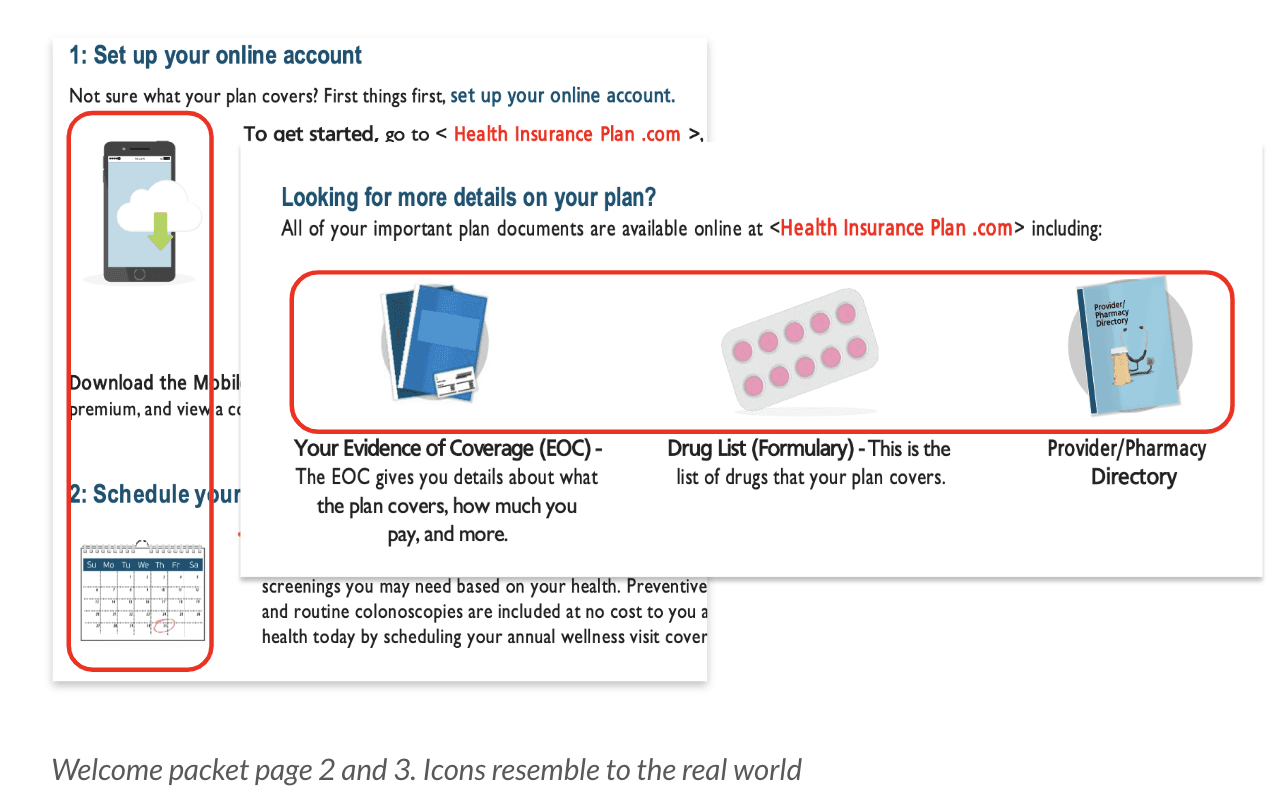

Match between system and real world
Match between system and real world
The icons in the welcome packet resembles to the real world and they are easily recognizable which helps users to understand the data quickly.
The icons in the welcome packet resembles to the real world and they are easily recognizable which helps users to understand the data quickly.

Consistency and Standards
Consistency and Standards
The structure of the entire welcome packet is easy to understand. The overall colors used are consistent across the document.
The structure of the entire welcome packet is easy to understand. The overall colors used are consistent across the document.
What can be improved in the medicare packet
What can be improved in the medicare packet
What can be improved in the medicare packet

User control and freedom
User control and freedom
It might be difficult for the users to follow the links given in the physical copy of welcome packet and map the instructions from it to the system.
It might be difficult for the users to follow the links given in the physical copy of welcome packet and map the instructions from it to the system.
Severity 3 - Major usability problem
Severity 3 - Major usability problem
Recommendation:
Using a QR code in the physical copy or sending a email with all the links to the user so that they can follow easily.
Recommendation:
Using a QR code in the physical copy or sending a email with all the links to the user so that they can follow easily.
Help & documentation, Flexibility and efficiency of use
Help & documentation, Flexibility and efficiency of use
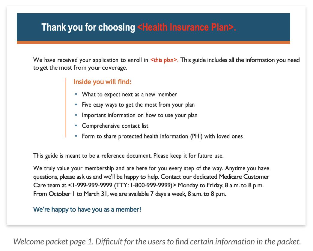
This packet will be used for a long time purpose. It will be difficult for the users to go through 17 pages packet to find a certain information
This packet will be used for a long time purpose. It will be difficult for the users to go through 17 pages packet to find a certain information
Severity 3 - Major usability problem
Severity 3 - Major usability problem
Recommendation:
Having an index with page numbers at the start of the packet will help users to find information quickly.
Recommendation:
Having an index with page numbers at the start of the packet will help users to find information quickly.

Aesthetic and minimalist design
Aesthetic and minimalist design
The information looks cluttered as there is lot of data in a single page.
The information looks cluttered as there is lot of data in a single page.
Severity 2 - Minor usability problem
Severity 2 - Minor usability problem
Recommendation:
Increasing line spacing and maintaining good hierarchy would help decreasing the clutter and improving the overall structure of showcasing the information.
Recommendation:
Increasing line spacing and maintaining good hierarchy would help decreasing the clutter and improving the overall structure of showcasing the information.
sability Testing
sability Testing
sability Testing
U
U
Based on the heuristic evaluation, from the severity ratings we came up with five tasks for the usability testing phase, which helped validate the problems identified. Seven participants were asked to perform tasks related to finding forms, understanding the phases of the Medicare plan, and interacting with URLs in the packet. After each task, a post task questionnaire was provided to find the effort, efficiency, and satisfaction of the participants. After the completion of all the tasks, a post test survey was provided to assess the overall usability of the welcome packet. The goal was to identify user behaviors, pinpoint usability issues, and provide insights to enhance the product.
Based on the heuristic evaluation, from the severity ratings we came up with five tasks for the usability testing phase, which helped validate the problems identified. Seven participants were asked to perform tasks related to finding forms, understanding the phases of the Medicare plan, and interacting with URLs in the packet. After each task, a post task questionnaire was provided to find the effort, efficiency, and satisfaction of the participants. After the completion of all the tasks, a post test survey was provided to assess the overall usability of the welcome packet. The goal was to identify user behaviors, pinpoint usability issues, and provide insights to enhance the product.
The tasks
The tasks
The tasks
Pre-Task - 6 minutes
Before starting the tasks, users are asked to skim through the Medicare Part D Welcome Packet to get an overall sense of its structure and content.
Why this task ?
This pre-task helped us observe how users engage with the document initially, identifying whether the layout and structure were intuitive and if users could quickly locate key sections.
Task 1 - 6 minutes
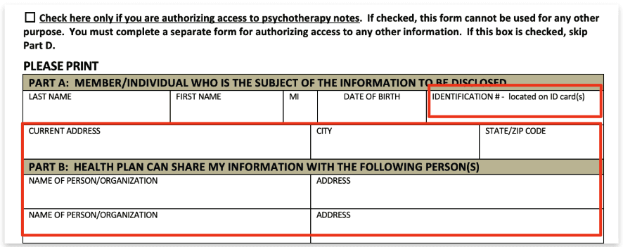
Finding the PHI form and filling it.
Success Criteria:
They figure out they have to fill PHI form
They are able to locate the form
Fill in the form with fictitious details
Why this task ?
This task was chosen to validate issues with unclear form fields and missing page navigation, as identified in the heuristic evaluation. It allowed us to observe how users interact with the form and identify areas for improvement in clarity and completion.
Task 2 - 6 minutes
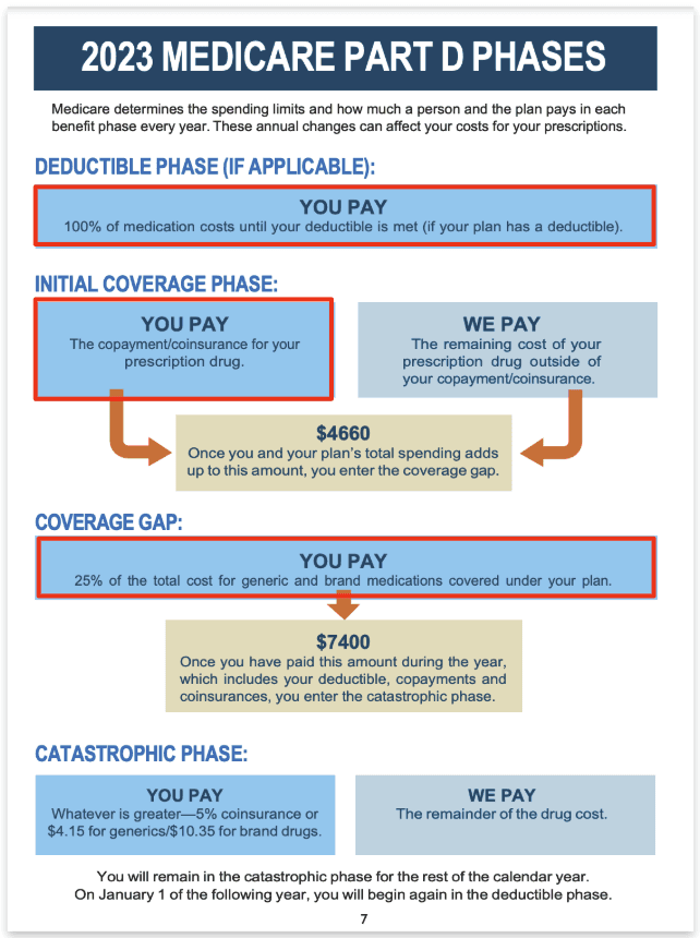
Understand Phase of Medicare Part D
Success Criteria:
Locate the Medicare Phase D on page 7
Understand they would be in the coverage gap phase
Answer it would entail them to pay 25% (out of pocket)
They understand the amount they are required to pay in every phase
Why this task ?
The heuristic evaluation revealed confusion around the phases and terminology. This task tested users' ability to navigate and understand the cost breakdowns, helping us pinpoint areas needing clearer explanations or consistent language
Task 3 - 6 minutes
Understanding the difference between LIS and EPIC
Success Criteria:
Completed all the tasks
Locate the 3 ways to save money on prescriptions on page 6 including LIS/EPIC
Able to understand which is more appropriate for them
Why this task ?
The evaluation highlighted confusion around cost-saving options. This task tested users’ ability to locate and understand the differences between LIS and EPIC, allowing us to assess the clarity of this information and its relevance.
Task 4 - 6 minutes
Interaction with URLs present in the welcome packet.
Success Criteria:
Completed all the tasks
Locate the HIV link on page 9 or 11
Redirect to the State Health website
Find the appropriate form/s
Why this task ?
Users had difficulty following links, as identified in the heuristic evaluation. This task allowed us to test how users interacted with URLs and whether QR codes helped improve navigation and accessibility.
Task 5 - 6 minutes
Understanding additional resources available.
Success Criteria:
Completed all the tasks
Finds ‘Mail Order Pharmacies’
Figures out that they have to call or go to the pharmacy website
Why this task ?
The "Additional Resources" section was cluttered, according to the heuristic evaluation. This task tested users' ability to find and understand resources, helping us determine if reorganizing the section improved usability.
Pre-Task - 6 minutes
Before starting the tasks, users are asked to skim through the Medicare Part D Welcome Packet to get an overall sense of its structure and content.
Why this task ?
This pre-task helped us observe how users engage with the document initially, identifying whether the layout and structure were intuitive and if users could quickly locate key sections.
Task 1 - 6 minutes
Finding the PHI form and filling it.
Success Criteria:
They figure out they have to fill PHI form
They are able to locate the form
Fill in the form with fictitious details
Why this task ?
This task was chosen to validate issues with unclear form fields and missing page navigation, as identified in the heuristic evaluation. It allowed us to observe how users interact with the form and identify areas for improvement in clarity and completion.
Task 2 - 6 minutes
Understand Phase of Medicare Part D
Success Criteria:
Locate the Medicare Phase D on page 7
Understand they would be in the coverage gap phase
Answer it would entail them to pay 25% (out of pocket)
They understand the amount they are required to pay in every phase
Why this task ?
The heuristic evaluation revealed confusion around the phases and terminology. This task tested users' ability to navigate and understand the cost breakdowns, helping us pinpoint areas needing clearer explanations or consistent language
Task 3 - 6 minutes
Understanding the difference between LIS and EPIC
Success Criteria:
Completed all the tasks
Locate the 3 ways to save money on prescriptions on page 6 including LIS/EPIC
Able to understand which is more appropriate for them
Why this task ?
The evaluation highlighted confusion around cost-saving options. This task tested users’ ability to locate and understand the differences between LIS and EPIC, allowing us to assess the clarity of this information and its relevance.
Task 4 - 6 minutes
Interaction with URLs present in the welcome packet.
Success Criteria:
Completed all the tasks
Locate the HIV link on page 9 or 11
Redirect to the State Health website
Find the appropriate form/s
Why this task ?
Users had difficulty following links, as identified in the heuristic evaluation. This task allowed us to test how users interacted with URLs and whether QR codes helped improve navigation and accessibility.
Task 5 - 6 minutes
Understanding additional resources available.
Success Criteria:
Completed all the tasks
Finds ‘Mail Order Pharmacies’
Figures out that they have to call or go to the pharmacy website
Why this task ?
The "Additional Resources" section was cluttered, according to the heuristic evaluation. This task tested users' ability to find and understand resources, helping us determine if reorganizing the section improved usability.
articipants Insights & Our Recommendations
articipants Insights & Our Recommendations
articipants Insights &
Our Recommendations
P
P
Participants Insights:
Participants Insights:
3/7 participants found the address form field format in part A better than part B as it was split better.
4/7 participants got confused about the ID form field.
3/7 participants found the address form field format in part A better than part B as it was split better.
4/7 participants got confused about the ID form field.
“I would enter my ID card number from insurance company”, or “should i put phone number?” - One of the participant mentioned
“I would enter my ID card number from insurance company”, or “should i put phone number?"
- One of the participant mentioned
Recommendation:
The address fields can use the same format for both Part A and Part B of the form.
A format can be given as an example in ID and date fields to reduce error rates and confusion.
Recommendation:
The address fields can use the same format for both Part A and Part B of the form.
A format can be given as an example in ID and date fields to reduce error rates and confusion.
Participants Insights:
Participants Insights:
5/7 participants were confused with the terminology present in Medicare Part D Phases
They were not able to understand what copayment/coinsurance, 25% of total cost etc
5/7 participants were confused with the terminology present in Medicare Part D Phases
They were not able to understand what copayment/coinsurance, 25% of total cost etc
“I wasn’t entirely sure how much money is going where”
- One of the participant mentioned
“I wasn’t entirely sure how much money is going where”
- One of the participant mentioned
Recommendation:
A sample scenario with explanation of which phase user is at would make users understand better
Appendix for the technical words could be mentioned at the beginning
Recommendation:
A sample scenario with explanation of which phase user is at would make users understand better
Appendix for the technical words could be mentioned at the beginning
ighlights
ighlights
ighlights
H
H
Participants liked the graphics, and how the information was laid out throughout the document.
Participants liked the graphics, and how the information was laid out throughout the document.
Majority of the participants found PHI form, Medicare phases and benefits in the packet
Majority of the participants found PHI form, Medicare phases and benefits in the packet
Majority the participants said they were comfortable with typing the entire URL link from the packet
Majority the participants said they were comfortable with typing the entire URL link from the packet
Participants were confused with the current text hierarchy and terminology.
Participants were confused with the current text hierarchy and terminology.
Participants had to flip through the whole packet to find information when needed
Participants had to flip through the whole packet to find information when needed
Participants preferred binded copy of the packet
Participants preferred binded copy of the packet
uccess Metrics
uccess Metrics
uccess Metrics
S
S

Task Completion Time
Task Completion Time
Task completion times varied across tasks, with the PHI form taking the longest (7 minutes 2 seconds), while Home Delivery was the quickest (1 minute 7 seconds).
Task completion times varied across tasks, with the PHI form taking the longest (7 minutes 2 seconds), while Home Delivery was the quickest (1 minute 7 seconds).
Impact
Impact
Tasks that involved form fields or complex terminology (like in the PHI form and Medicare phases) took longer due to confusion. Simplifying language and improving instructions could significantly reduce time spent on these tasks.
Tasks that involved form fields or complex terminology (like in the PHI form and Medicare phases) took longer due to confusion. Simplifying language and improving instructions could significantly reduce time spent on these tasks.

Success Rate
Success Rate
Success rates showed variation across tasks. For example, Task 1 (PHI Form) had 5 completions, but 2 participants partially completed it due to confusion in form fields. Task 5 (Home Delivery) had a 50% partial completion rate.
Success rates showed variation across tasks. For example, Task 1 (PHI Form) had 5 completions, but 2 participants partially completed it due to confusion in form fields. Task 5 (Home Delivery) had a 50% partial completion rate.
Impact
Impact
Tasks that required navigating complex sections (like the Medicare phases or form fields) had lower success rates due to unclear instructions and terminology. By clarifying these sections and improving the layout, we could enhance completion rates.
Tasks that required navigating complex sections (like the Medicare phases or form fields) had lower success rates due to unclear instructions and terminology. By clarifying these sections and improving the layout, we could enhance completion rates.

User Satisfaction
User Satisfaction
Satisfaction was generally positive, with most participants finding the packet visually appealing. However, dissatisfaction arose in sections with confusing terminology and layout issues, such as the Medicare phases and “Additional Resources”.
Satisfaction was generally positive, with most participants finding the packet visually appealing. However, dissatisfaction arose in sections with confusing terminology and layout issues, such as the Medicare phases and “Additional Resources”.
Impact
Impact
Simplifying the design and terminology, and improving the structure of the packet, would not only reduce confusion but also enhance overall satisfaction. Recommendations like adding an index and QR codes were highlighted by users as helpful improvements.
Simplifying the design and terminology, and improving the structure of the packet, would not only reduce confusion but also enhance overall satisfaction. Recommendations like adding an index and QR codes were highlighted by users as helpful improvements.

Confidence and Effort
Confidence and Effort
Most participants felt confident after completing tasks (e.g., 6/7 participants were confident in filling the PHI form), but some struggled with the "Medicare phases" and “Mail Order Pharmacies” sections, reflecting a higher effort to complete the tasks.
Most participants felt confident after completing tasks (e.g., 6/7 participants were confident in filling the PHI form), but some struggled with the "Medicare phases" and “Mail Order Pharmacies” sections, reflecting a higher effort to complete the tasks.
Impact
Impact
The lack of clear guidance in certain areas (such as the Medicare phases and Mail Order Pharmacies) led to more effort from users. Improved clarity and organization could reduce cognitive load and enhance user confidence.
The lack of clear guidance in certain areas (such as the Medicare phases and Mail Order Pharmacies) led to more effort from users. Improved clarity and organization could reduce cognitive load and enhance user confidence.
earnings
earnings
earnings
L
L
Hands-On Experience: "Participating in usability testing gave me valuable experience in planning, collaborating with my team, and analyzing user feedback, particularly from tasks like the PHI form and Medicare phases."
Navigating Constraints: "This being my first client collaboration, I learned to work within project constraints, like adhering to healthcare regulations while balancing business goals and user needs."
Overcoming Challenges: "I faced challenges in participant recruitment due to the demographic and team coordination due to different schedules, but overcoming these helped me improve time management and adaptability."
Refining Design Recommendations: "I developed a deeper understanding of how to refine design recommendations based on direct user feedback, ensuring our solutions were both user-centered and aligned with business goals."

