Team
3 Designers, 1 PM, 1 Lead
Role
Product Designer
Time Stamp
October 2025 - February 2025

STREAMLINING WAREHOUSE OPERATIONS
Project
A Workflow Redesign for Orbit
edesigned a B2B commerce platform across two connected layers: BulkMagic's marketing experience and Orbit's supplier-facing product experience.
R
10+
Screens Audited
Reviewed onboarding, inventory, supplier, admin, warehouse, and operational workflows to identify navigation gaps, task-flow inefficiencies, hierarchy issues, and inconsistent UI patterns.
3
Role-based workflows redesigned
Redesigned key flows for suppliers, warehouse owners, and admins so each user group could access role-specific tasks within a more unified platform structure.
~30%
Fewer key task steps
Reduced repeated navigation and unnecessary decision points by simplifying dashboard layouts, improving task progression, and restructuring supplier onboarding.
5
Operational modules standardized
Created a consistent system across shipments, inventory, orders, staff members, and public warehouses using shared card layouts, status badges, and action placement.
O
verview
Welcome to Orbit
Your central hub for streamlined supply chain.
Supplier
Warehouse
Admin
Sign in
Dashboard
Total Sales
$21,430
Total Orders
24
Pending
18
Supplier Approved
You are now part of our trusted supplier network.
✓ APPROVED
Orbit is BulkMagic's B2B2C commerce platform — built to help vendors, exporters, and small businesses sell, store, and ship products worldwide from one connected ecosystem. It supports three distinct roles: Suppliers (who list, sell, and ship), Warehouse Owners (who receive, store, and fulfill), and Administrators (who oversee operations and access).
My Role & Goal: As a Product Designer in a small team, I redesigned the supplier-facing experience after a structured audit of the first version surfaced friction in marketing intent, onboarding pacing, and module consistency. The work spanned the marketing site, supplier onboarding, the approved supplier portal, and the operational modules used post-approval.
T
wo Connected Workstreams
One project, two distinct surfaces. BulkMagic needed a clearer entry point for businesses evaluating the platform. Orbit needed to actually deliver on what that entry point promised.
Workstream 01
BulkMagic — Marketing Experience
Goal
Clarify the business offering and build trust before conversion.
· Homepage flow and section hierarchy
· CTA intent separation
· Service and solution page structure
· Trust-building before form placement
· Testimonials, FAQ, and offering proof
BulkMagic needed to explain the broader ecosystem before asking vendors, exporters, or businesses to connect.
Workstream 02
Orbit — Product Experience
Goal
Help suppliers move from first-time setup to active operations.
· Role-based login and entry
· Supplier onboarding and profile hub
· Dashboard structure and clarity
· Shipments, inventory, and orders modules
· Shared status patterns and action placement
Orbit needed to feel like a structured operational platform, not a collection of disconnected modules.
T
he Problem
The first version covered breadth fast — but breadth without clarity meant suppliers were asked to commit before either trust or context had been established.
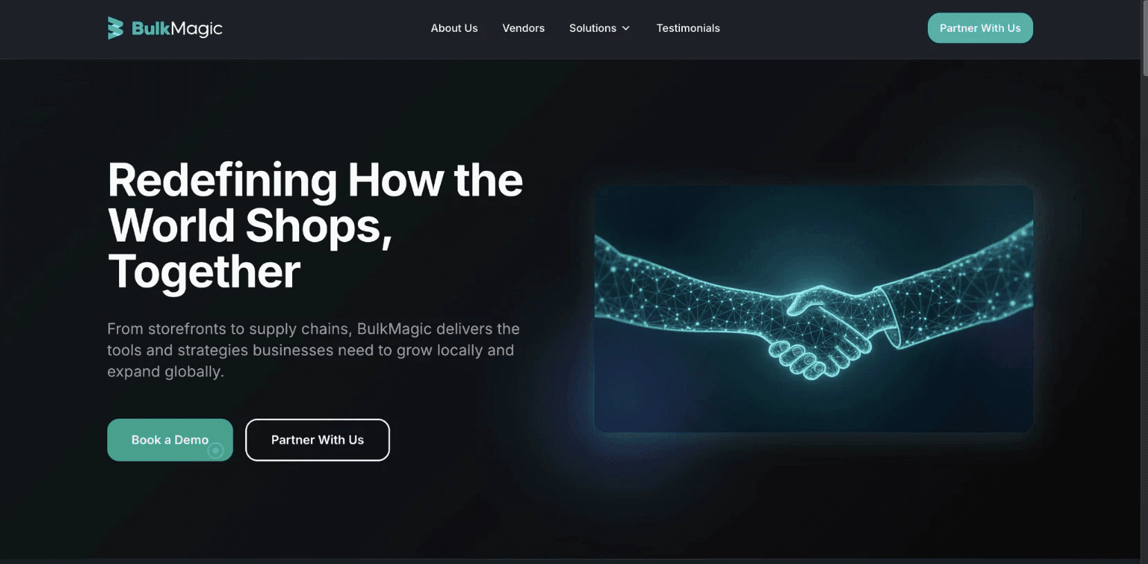
1 · BulkMagic Homepage
01
The entry point was broken
The marketing site asked for commitment before establishing credibility. "Book a Demo" and "Partner With Us" pointed at the same form — different intents, same dead end. Suppliers had no reason to trust the platform at the exact moment they were being asked to.
02
Onboarding asked for everything at once
First-time suppliers were dropped into a single dense flow asking for legal, financial, compliance, and ownership data simultaneously. No progress clarity, no segmentation, no sense of what came next. The platform treated onboarding like a form to complete, not a relationship to start.
03
The platform looked like three different products
Shipments, Inventory, and Orders were each built independently - no shared grammar, no consistent patterns.
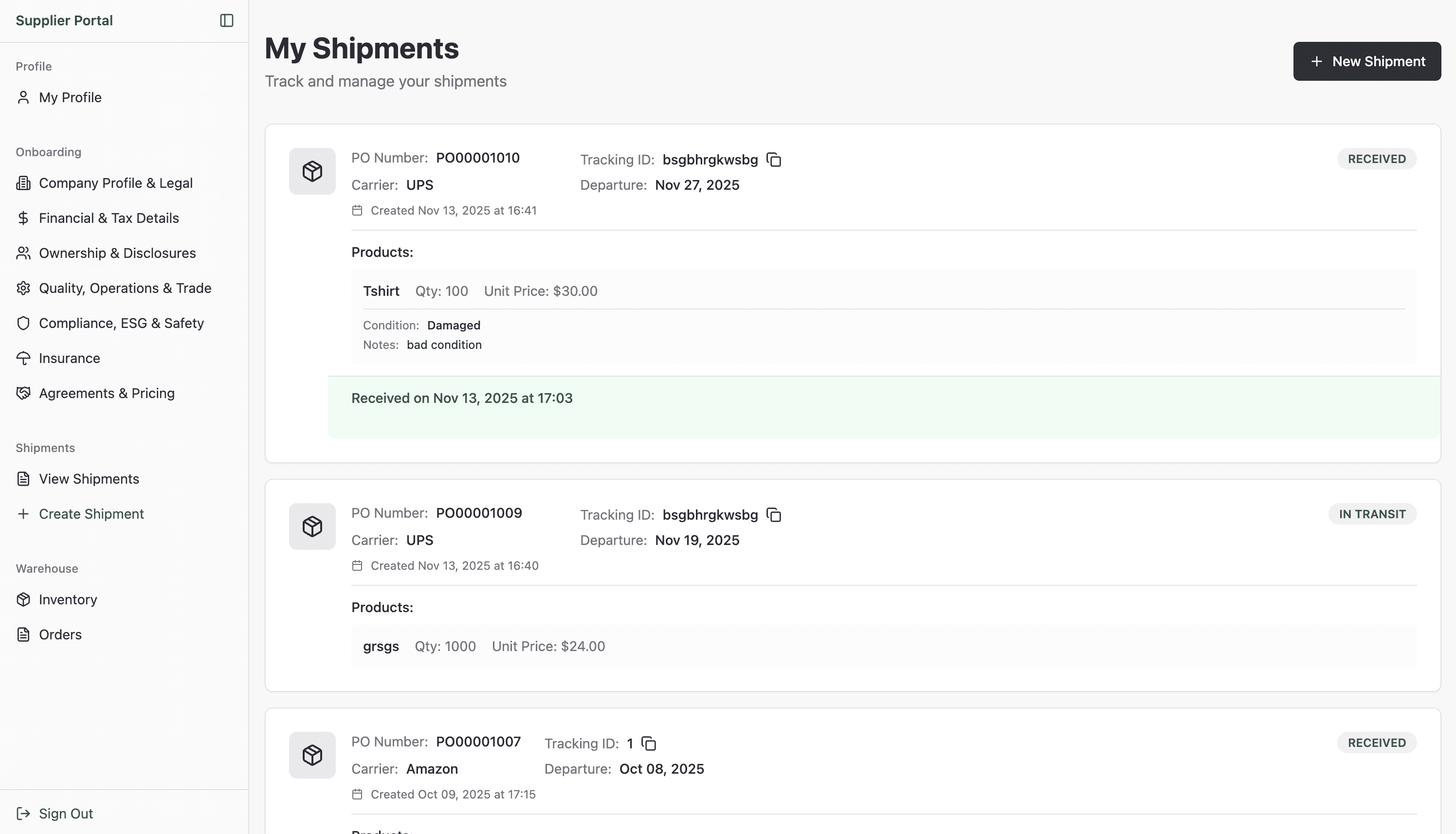
3a · Shipments
Its own card style, its own status language, its own table structure. Built independently, with no shared grammar.

3B · inventory
Looked entirely different. Same supplier, same session, completely different interface logic.
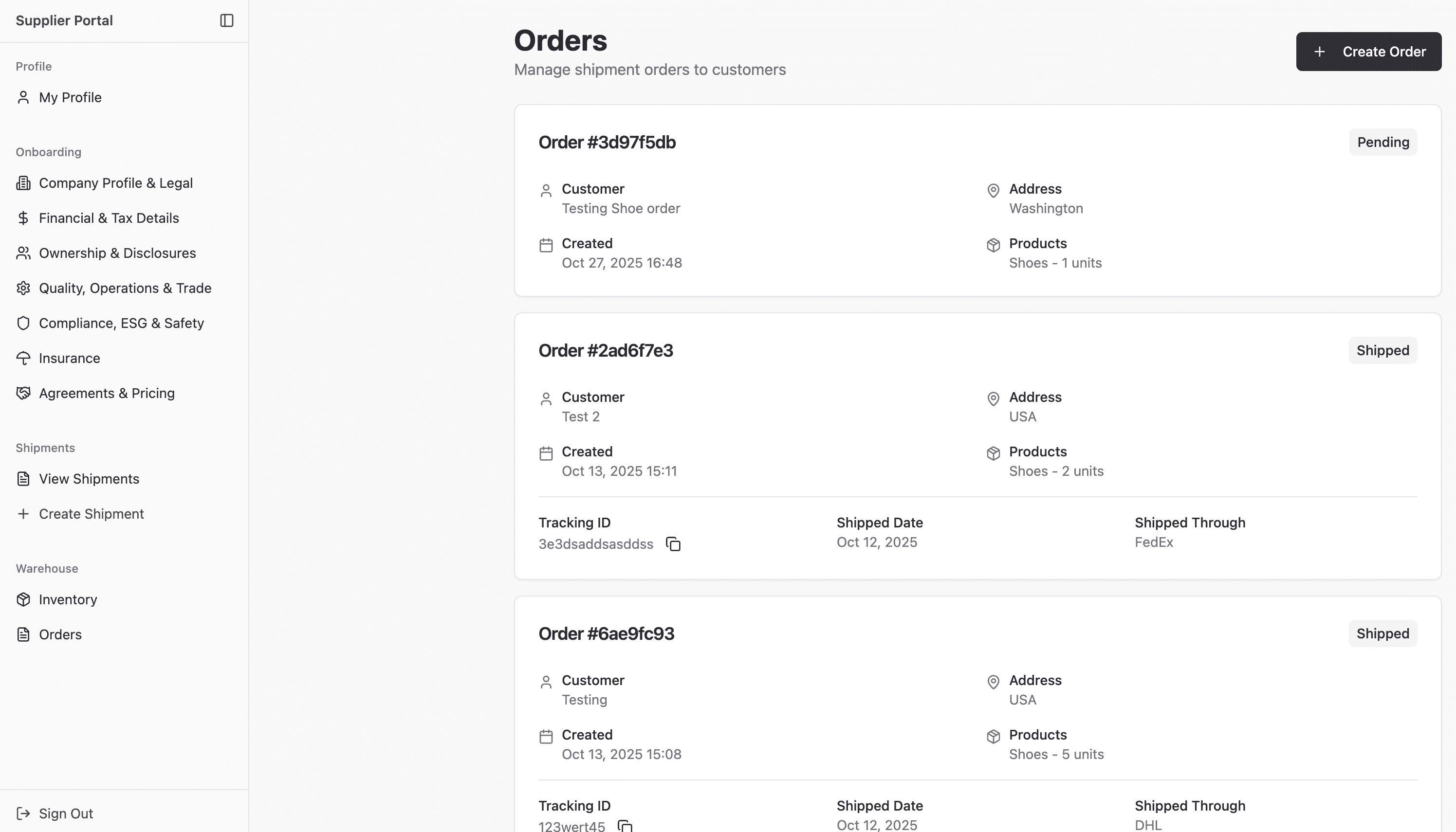
3C · orders
Drifted furthest. A supplier moving across all three modules had to relearn the platform each time. Three surfaces, three visual languages, one confused user.
A polish pass wouldn't fix this. The friction was structural - it lived in what came first, what was grouped together, and what looked the same.
A
n Audit, Not a Refresh
The redesign began with a structured review across both the marketing entry point and Orbit's product experience. The goal was to convert each finding into a defensible design direction we could measure against later.
BulkMagic - Marketing Audit
High · Conversion path
Finding 01
Transactional vs. Partnership Voice
Marketing CTAs sounded transactional, not partnership-oriented. B2B suppliers evaluate platforms relationally — language signals how they'll be treated as partners.
High · Conversion path
Finding 02
CTA Intent Collision
"Book a Demo" and "Partner With Us" CTAs led to the same form, creating expectation mismatch. Different intents need different paths.
Critical · Architecture
Finding 03
Form-Before-Trust Sequencing
The contact form appeared before any solutions, testimonials, or capability content. Suppliers had no reason to convert at the moment of being asked to.
ORBIT - PRODUCT Audit
High · First-run UX
Finding 04
Onboarding Density
First-time onboarding asked for legal, financial, ownership, compliance, and insurance data in a single flow with no progressive segmentation or completion state.
High · Operational system
Finding 05
Module Drift
Five modules used five different table layouts, status treatments, and action patterns — despite being used by the same supplier in a single session.
Medium · Design system
Finding 06
Two Visual Languages
The system had drifted between an admin shell and accent-heavy marketing treatments, with no shared tokens. The platform read as multiple products.
How I measured the friction
I reviewed 10+ screens across supplier onboarding, profile management, shipments, inventory, orders, warehouse workflows, and admin-facing operations. Instead of treating each screen as a separate UI issue, I grouped recurring problems into four categories: navigation gaps, task-flow inefficiencies, visual hierarchy issues, and inconsistent module patterns.
The audit showed that the platform was functionally broad, but structurally fragmented. Suppliers could complete tasks, but the system required too much interpretation. Similar objects looked different across modules, status states were not always consistent, and onboarding asked for too much information before users had a clear sense of progress.
This helped me define the redesign goals: reduce unnecessary steps, make task progression clearer, standardize repeated patterns, and create one scalable system across multiple roles.
Each finding became a hypothesis tested against the redesign. None of the recommendations were aesthetic.
S
trategy
Instead of treating the redesign as isolated screen improvements, we restructured the system around four principles. Every later decision is traceable back to one of these.
01
Trust Before Action
Trust-building content moves ahead of conversion prompts. Suppliers see why before being asked whether.
02
Progressive Complexity
Onboarding splits into two short steps. The 7-section profile becomes a hub with progress tracking. Each step asks for one decision category.
03
Operational Consistency
All modules share the same card patterns, status badges, table layouts, and primary-action placement. The same kind of object behaves the same way.
04
One System, Three Roles
Supplier, Warehouse Owner, and Administrator all enter through one role-tabbed login and operate inside the same dark-theme shell.
M
arketing Redesign
The marketing experience was the first trust-building layer of the BulkMagic ecosystem. It needed to explain the parent platform, clarify solution paths, and build enough confidence before users entered Orbit or contacted the team.

Step 01
Hero — intent made legible
I reframed the hero from a vague brand statement into a clearer business-growth proposition. The updated headline explains how BulkMagic supports local and global commerce, while the CTAs now separate two user intents: Let’s Connect for conversion and Portfolio for exploration.
Step 02
Trust before anything else
Five partner logos land immediately below the hero before any section asks the visitor to do anything. In V1 there was no trust strip at this level. A B2B supplier evaluating a platform needs to see who else is here before they decide to keep reading.
Step 03
Platform before products
The About Us section ("BulkMagic is a unified B2B2C commerce platform") establishes the whole ecosystem before the three pillars — E-commerce Storefronts, Smart Fulfillment, Micro-Warehousing — go into product specifics. Without this, a visitor landing on one capability misses the full range. V1 had no platform-level positioning — it went straight to capabilities with no context for why they belong together.
Step 04
Audience value before the ask
"Designed to Power Your Business Growth" with Local/Global tabs and four feature areas (Digital Storefronts, Customer Loyalty, Local Marketing, Inventory Management) gives visitors a clear picture of what the platform does for them before the contact form appears. The ask only comes after the value has been established.
Step 05
Social proof before commitment
One structural decision I prioritized was moving credibility closer to the conversion moment. Testimonials and client proof needed to appear before the contact form so users had evidence of trust before being asked to take action.
O
rbit Solution Page
The BulkMagic homepage explained the ecosystem. The Orbit page had a different job - take one specific solution and make it real enough that a warehousing business would trust it with their operations.
Step 01
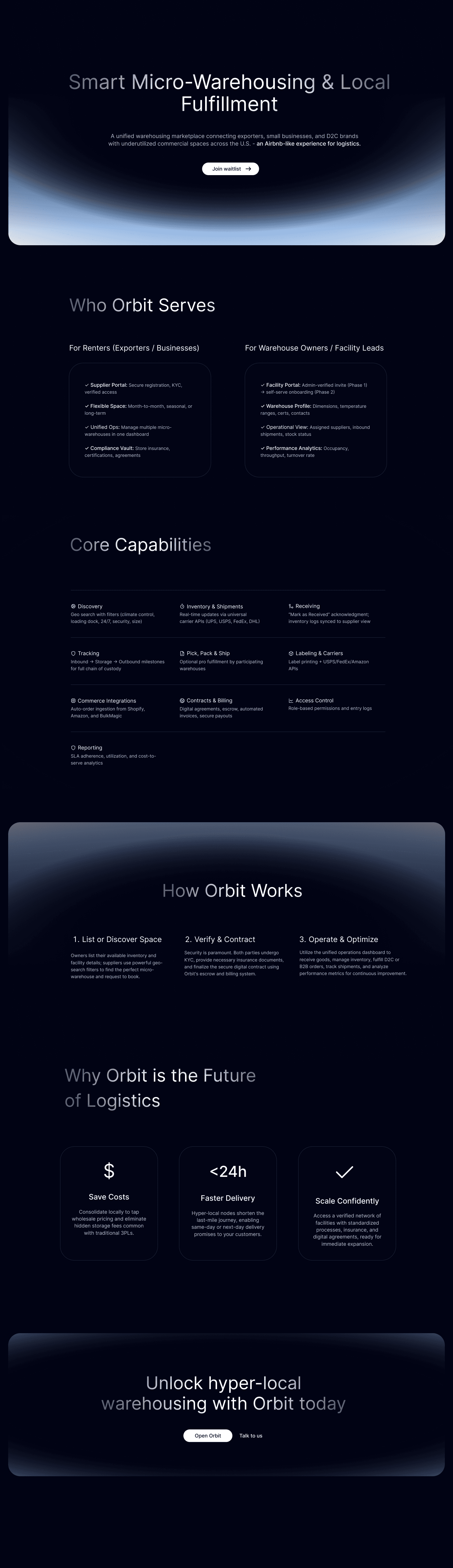
Hero - one specific promise, not the whole platform
The BulkMagic homepage explained the ecosystem. This page does one job: tell warehousing users exactly what Orbit is. "Smart Micro-Warehousing & Local Fulfillment" and "an Airbnb-like model for logistics" in the subtitle - two sentences that make the value concrete. A single CTA ("Join waitlist") replaces any collision. There is nothing to misread.
Step 02
Two audiences separated from line one
"Who Orbit Serves" splits into Renters/Exporters and Warehouse Owners immediately - each column lists what that side gets from the platform. This is not a generic feature list. It is two different value propositions living on one page, each speaking directly to a different reader. A supplier knows they are in the right column within seconds.
Step 03
Operational proof, not marketing language
Core Capabilities lists 10 specific operational features: Discovery, Inventory & Shipments, Receiving, Tracking, Pick Pack & Ship, Labelling & Carriers, Commerce Integrations, Contracts & Billing, Access Control, Reporting. These are not benefit statements. They are system capabilities. For a business evaluating a logistics partner, this level of specificity is trust-building in itself.
Step 04
Complexity collapsed into three steps
"How Orbit Works" - List or Discover Space → Verify & Contract → Operate & Optimize. What is actually a multi-month operational relationship gets distilled into three phases. This is not oversimplification. It is the right level of abstraction for a decision page. The detail lives in the product. The page's job is to make the path feel achievable.
Step 05
CTA earns its place
"Unlock hyper-local warehousing with Orbit today" - two buttons: Open Orbit and Talk to us. By the time a visitor reaches this, they have seen the promise, their role, the capabilities, the business case, and the process. The CTA is not asking for trust. It is confirming a decision that has already been made. This is the difference between a page that converts and a page that just exists.
From promise to platform
Both marketing surfaces did their job — trust established, intent clarified, path made clear. But a supplier clicking "Open Orbit" doesn't experience a handoff. They experience one continuous thing. The product had to pick up exactly where the marketing left off: not restart the pitch, not ask for trust again, but treat the supplier as someone already convinced — and deliver on that.
P
roduct Redesign
Behind the marketing site is the platform — three role-based portals, a two-step supplier setup leading into a 7-section onboarding hub, and six modules across supplier and admin roles. The redesign treated all of this as one system.
6a · One entry, three roles
One Welcome screen, three role tabs
A single Welcome to Orbit page replaces the segmented login flow. Three role cards - Supplier, Warehouse Owner, Administrator - each describe what that role does before asking for credentials. The platform tells you where you belong before it asks you to sign in.


6b · First-time onboarding
Two short steps with explicit progress
The dense V1 intake splits into Tell us about your company → Add your primary contact. Each step asks for one decision category. The step indicator sets expectation early - completion ends in a profile-creation success state, not another wall of forms.
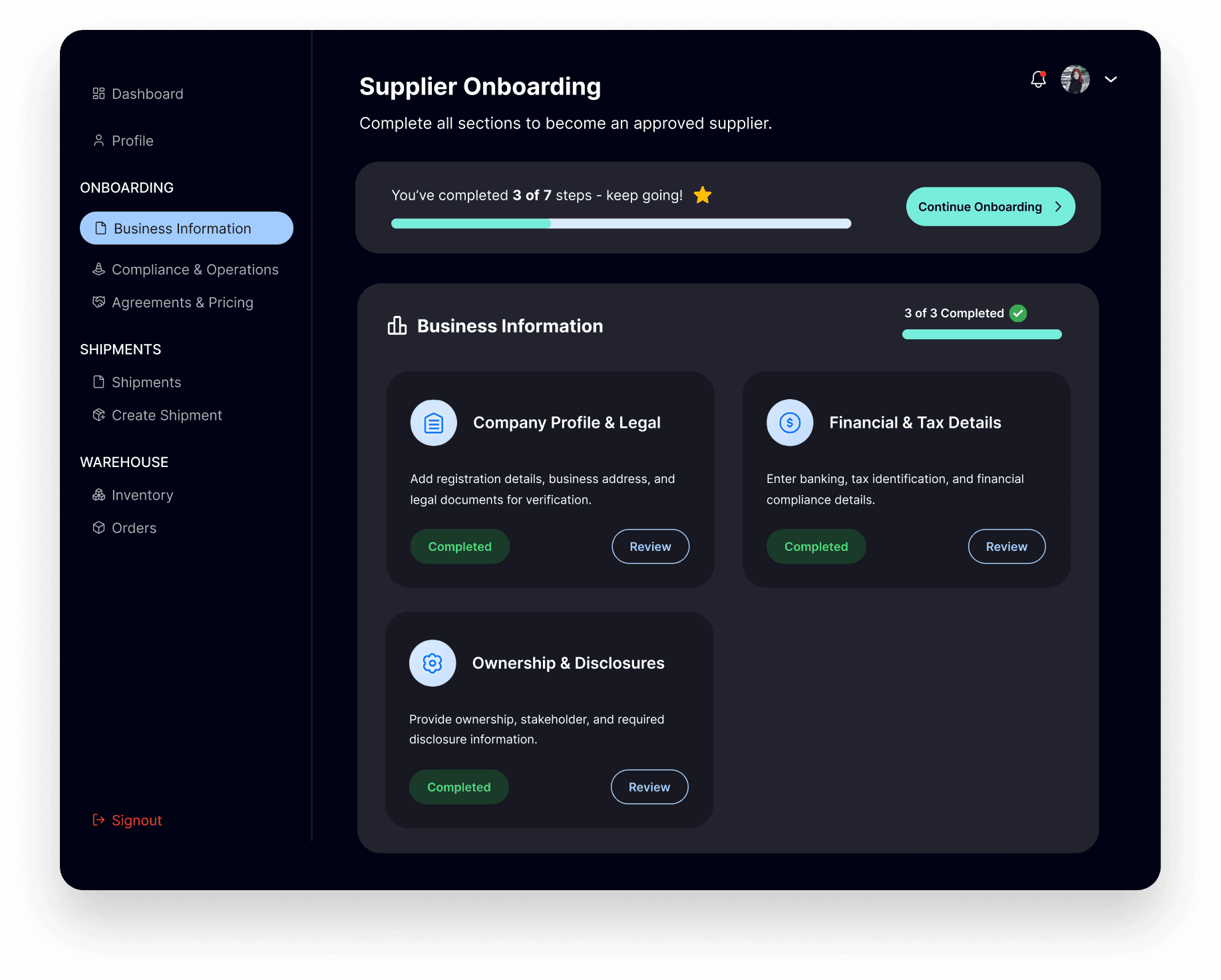
6c · The 7-section onboarding hub
From linear flow to completion hub
Once inside, suppliers land on a hub showing seven sections as cards with explicit Pending / Completed states and a progress bar - "You've completed 3 of 7 steps - keep going!" Suppliers complete what's relevant when it's relevant, not what the system demands up front.
6d · The supplier dashboarD
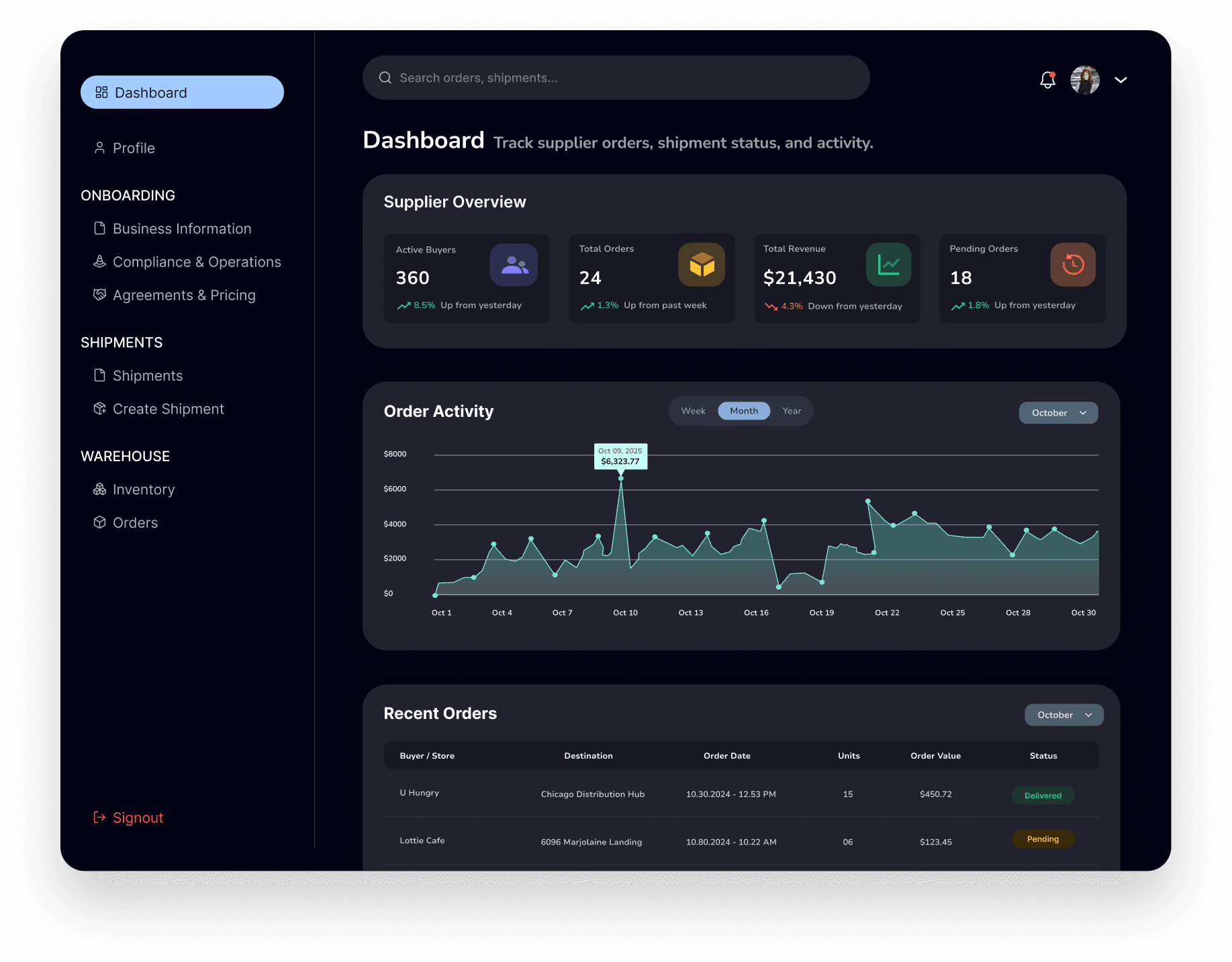
Operations as one canvas
Today's Sales summary, Sales Details time-series chart, and Deals Details table on a single canvas. The sidebar groups work into Profile, Onboarding, Shipments, Warehouse - matching how suppliers actually think about their day.
~30%
Fewer key task steps
Impact on task flow
One of the biggest improvements was reducing the number of steps required for common supplier tasks. In the first version, suppliers had to move through dense onboarding and independently structured modules, which created repeated navigation and extra decision points.
In the redesign, I split the first-time setup into shorter steps, moved detailed requirements into a 7-section onboarding hub, and made progress visible through Pending and Completed states. I also standardized the way suppliers moved between dashboard, profile, onboarding, shipments, inventory, and orders.
This reduced key task steps by approximately 30% across important supplier workflows - especially around onboarding completion, profile updates, and moving into operational modules.
Measured across the supplier onboarding, profile update, and module-to-module navigation flows by counting required clicks and decision points in V1 vs. final.
F
rom Audit to System
The audit didn't just identify problems — it surfaced the underlying cause: the platform had been built module by module, not as a system. These are the three decisions that changed that.
01
Structural Consistency
Build one grammar, not six layouts
Suppliers don't use one module. They move between Shipments, Inventory, and Orders in a single session. Every structural difference between those surfaces — a different card layout here, a different status badge there — is friction they absorb on every switch. The decision was to standardise the card structure, status badges, and primary action placement across all six modules. Once a supplier learns one, they already know the rest. The interface stops being something they have to figure out and starts being something they can rely on.
02
Visual Cohesion
One visual language, regardless of where you are
V1's light theme with per-module accents made each surface feel like a different product. That's not a visual problem — it's a trust problem. A supplier moving between modules shouldn't have to re-establish where they are. A unified dark theme with a single teal accent removes that visual switching cost and creates a platform identity coherent enough to hold a supplier's confidence across the entire operational layer, not just the screen in front of them.
03
System Scalability
Design the grammar once — every new module inherits it
Orbit will grow. New modules, new roles, new surfaces. If each one is designed from scratch, the system fragments again over time — different calls compounding with every release. Codifying the card pattern, status grammar, and sidebar structure into a shared system means the platform can scale without the design quality degrading. The admin layer — Staff Members, Warehouses, Supplier Submissions — was the first proof of this: three surfaces built against the same grammar without having to re-establish the rules.
The system — all six modules
Supplier · Modules 01–03

Shipments
PO cards with status, departure date, carrier, and product rows. Create Shipment anchored top-right.

Inventory
Warehouse stats at top — total products and units — before any individual items. Macro position always visible first.
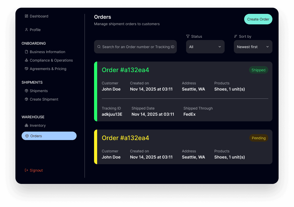
Orders
Customer, date, address, and products per card. Status badges carry the same colour logic as Shipments.
Admin Layer · Modules 04–06
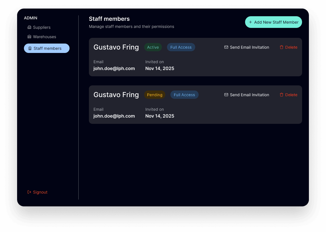
Staff Members
Name, email, role chip, and status badge per row. Actions anchored right on every row.

Warehouses
Warehouse name, status, owner, and contact in one row. Add New Warehouse anchored top-right.

Supplier Submissions
The admin view of the onboarding hub. Colour-coded left border mirrors the status the supplier sees from their side.
O
utcome & Reflection
The strongest outcome of this redesign was not just a cleaner set of screens, but a more connected supplier experience. Orbit started to feel less like separate tools for onboarding, inventory, shipments, and orders, and more like one system that could guide a supplier from initial interest to active operation. By using shared patterns for status, task progression, profile completion, and next actions, the product also became easier to scale across multiple roles and workflows without adding unnecessary complexity.
For me, this project changed how I think about B2B product design. I learned that trust is not created only through polished UI. It comes from clear decisions, predictable flows, transparent status, and helping users understand what to do next. In a supplier platform, every screen has to answer one question clearly: can I trust this system to support my business?
Clarity builds trust
In operational products, users do not just need information - they need confidence that the system is guiding them correctly.
Systems matter more than screens
The biggest improvement came from connecting modules through shared patterns instead of improving each page in isolation.
Scalability is a design decision
Reusable layouts, status language, and action patterns made the experience easier to extend as the product grew.