Team
Independent Research
Role
UX Researcher
Time Stamp
January 2024 - December 2024

ENHANCING
WEARABLE UX
ENHANCING
WEARABLE UX
Project
Project
UX Research, Mixed-Methods Study
Team
5 UX Researchers
Role
UX Researcher
Time Stamp
January 2023 - May 2023
H
H
ow conducting a mixed-methods study helped improve smartwatch health and fitness features for older adults through actionable design recommendations for better usability and accessibility?
ow conducting a usability study on a Medicare Part D Welcome Packet identified key usability issues, resulting in actionable recommendations that enhanced the user experience?
ummary
ummary
ummary
S
S

Smartwatch makers are failing to capture the 50 - 65 demographic due to significant usability and trust issues. This case study details a mixed-methods study that identified the critical product gaps alienating these users. The research revealed a core disconnect: while this demographic relies on simple, passive tracking like heart rate and step counting, they abandon advanced features like sleep tracking due to poor discoverability and confusing data interpretation. The project culminated in a set of actionable design recommendations, including a simplified interface and contextual feedback, focused on increasing engagement, building user trust, and expanding adoption of wearable health technology for this underserved market.
Smartwatch makers are failing to capture the 50 - 65 demographic due to significant usability and trust issues. This case study details a mixed-methods study that identified the critical product gaps alienating these users. The research revealed a core disconnect: while this demographic relies on simple, passive tracking like heart rate and step counting, they abandon advanced features like sleep tracking due to poor discoverability and confusing data interpretation. The project culminated in a set of actionable design recommendations, including a simplified interface and contextual feedback, focused on increasing engagement, building user trust, and expanding adoption of wearable health technology for this underserved market.
Research Questions
Research Questions
Research Questions
What health and fitness features on smartwatches do older adults use most frequently, and in what contexts?
What usability, accessibility, and interaction barriers do older adults face when using advanced smartwatch features, and how can these barriers be mitigated?
We will discuss how I came up with these research questions in the Define section below.
Tools And Techniques Used
Description 1
Tools And Techniques Used

Qualtrics & Google Forms for survey design, distribution, and post-task feedback collection.
Heuristic Evaluation Applied Nielsen’s 10 heuristics to assess the packet's design and identify usability issues.

Zoom for facilitating remote contextual inquiries and user interviews.
Usability Testing
Conducted usability testing with 7 participants to validate the identified issues and gather actionable feedback.

Contextual Inquiry to observe real-time user interactions with smartwatches in natural settings.
Contextual Inquiry to observe real-time user interactions with smartwatches in natural settings.

In-depth Interviews to explore user motivations, expectations, and barriers in greater detail.
Task Analysis
Focused on identifying key tasks and ensuring they were aligned with user needs and expectations.

Affinity Mapping & Thematic Analysis for synthesizing qualitative insights into key usability themes.
Participant Feedback
Collected feedback from participants through surveys to assess user satisfaction and usability.

Descriptive Statistics to analyze and visualize quantitative data trends from the survey.
Descriptive Statistics to analyze and visualize quantitative data trends from the survey.
My Role
My Role
My Role
As sole UX researcher for this project, I led the end-to-end research process, from study design to actionable insights. This included creating surveys, running contextual inquiries and interviews, and analyzing both qualitative and quantitative data to uncover usability challenges older adults face with smartwatches. I translated these findings into clear, user-centered design recommendations that address the needs of this demographic and guide future product decisions.
As sole UX researcher for this project, I led the end-to-end research process, from study design to actionable insights. This included creating surveys, running contextual inquiries and interviews, and analyzing both qualitative and quantitative data to uncover usability challenges older adults face with smartwatches. I translated these findings into clear, user-centered design recommendations that address the needs of this demographic and guide future product decisions.
Demographics
Demographics
Demographics
Target Audience: Older adults aged 50–65 with varying levels of digital literacy
Criteria: Active smartwatch users focused on health and fitness
Participants: 30 Survey Respondents, 7 Contextual Inquiries and Interviews
Target Audience: Older adults aged 50–65 with varying levels of digital literacy
Criteria: Active smartwatch users focused on health and fitness
Participants: 30 Survey Respondents, 7 Contextual Inquiries and Interviews
UX Process & Approach
UX Process & Approach
rocess
rocess
rocess
P
P
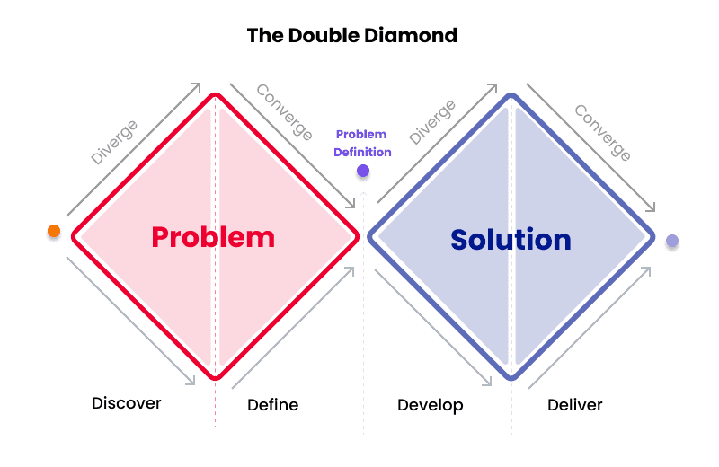
Double Diamond Process
Double Diamond Process
Double Diamond Process
I followed the Double Diamond framework to structure this project, balancing problem discovery with solution development. During the early stage, I uncovered the key usability and adoption barriers older adults face with smartwatch health features. In the later stage, I translated these insights into design opportunities and actionable recommendations.

Through this process, I was able to:
Identify barriers to adoption and engagement through mixed-methods research
Synthesize insights into clear usability themes
Prioritize opportunities that addressed the most critical challenges
Deliver recommendations focused on trust, usability, and long-term engagement
Unclear Instructions: Feedback from both stakeholders and users revealed difficulty in understanding the packet's content.
Navigation Problems: Users reported challenges in finding relevant sections like coverage details and form instructions.
The goal was to identify usability issues and provide actionable recommendations to improve clarity and user experience.
Unresolved Issues: Increased confusion, higher support calls, and lower satisfaction.
Addressed Issues: Improved comprehension, clearer navigation, and reduced need for customer support.
The Medicare Part D Welcome Packet, essential for informing users about their benefits, presented significant challenges:
Navigation Issues: Users struggled to locate key information.
Confusing Terminology: Medical jargon made the content hard to understand.
Form Field Issues: Ambiguous instructions led to confusion and incorrect data entries.
1. Discover
1. Discover
The project began by investigating a clear business reality: despite a booming wearables market, adoption among adults aged 50–65 remains low. My initial research confirmed this was less about technology and more about design shortcomings that limited usability and trust.
The project began by investigating a clear business reality: despite a booming wearables market, adoption among adults aged 50–65 remains low. My initial research confirmed this was less about technology and more about design shortcomings that limited usability and trust.

From this, I developed a set of core hypotheses to validate with real users:
Interfaces designed for younger users were alienating older adults with small screens and cluttered layouts
Complex and unclear health data caused confusion and eroded trust in metrics like sleep and calories
A one-size-fits-all approach to features and customization failed to meet the specific needs of this demographic
This framed the core challenge: the problem wasn’t just adoption, but sustained engagement and trust. With this foundation, I moved beyond secondary research to uncover the real-world interaction challenges older adults face with smartwatch health features.
This framed the core challenge: the problem wasn’t just adoption, but sustained engagement and trust. With this foundation, I moved beyond secondary research to uncover the real-world interaction challenges older adults face with smartwatch health features.
2. Define
2. Define
Building on the discovery insights, I narrowed the focus to the most pressing issues for older adults: usability challenges, engagement drop-off, and confusion in interpreting health data. These patterns revealed that the core challenge was not simply adoption, but sustained trust and engagement with smartwatch health features.
Building on the discovery insights, I narrowed the focus to the most pressing issues for older adults: usability challenges, engagement drop-off, and confusion in interpreting health data. These patterns revealed that the core challenge was not simply adoption, but sustained trust and engagement with smartwatch health features.

To investigate further, I shaped two guiding research questions:
To investigate further, I shaped two guiding research questions:
What health and fitness features on smartwatches do older adults use most frequently, and in what contexts?
What health and fitness features on smartwatches do older adults use most frequently, and in what contexts?
What usability, accessibility, and interaction barriers do older adults face when using advanced smartwatch features, and how can these barriers be mitigated?
What usability, accessibility, and interaction barriers do older adults face when using advanced smartwatch features, and how can these barriers be mitigated?
These questions ensured that the next phase of research targeted real-world usage, task-level pain points, and personalization needs, setting a clear foundation for actionable design opportunities.
These questions ensured that the next phase of research targeted real-world usage, task-level pain points, and personalization needs, setting a clear foundation for actionable design opportunities.
3. Develop
3. Develop
With the research questions defined, I moved into the exploratory phase to understand how older adults actually interact with smartwatch health features - where they succeed, and where they struggle.
With the research questions defined, I moved into the exploratory phase to understand how older adults actually interact with smartwatch health features - where they succeed, and where they struggle.

I designed a mixed-methods study combining surveys, contextual inquiries, post-task surveys, and in-depth interviews to balance breadth (trends across a wider group) with depth (real-world behavior and motivations).
I designed a mixed-methods study combining surveys, contextual inquiries, post-task surveys, and in-depth interviews to balance breadth (trends across a wider group) with depth (real-world behavior and motivations).
🧾 Survey (n = 30)
Captured feature usage, satisfaction, and customization preferences among adults aged 50–65.
Responses provided a baseline understanding of which health features were adopted most frequently and how users perceived their value.
👀 Contextual Inquiry (n = 7)
I observed older adults completing 7 common smartwatch health tasks (e.g., setting goals, checking sleep data, viewing reminders) to capture how they interacted with real devices in real time.
This revealed where participants felt confident versus where usability broke down, highlighting issues in task completion, effort, and navigation flow.

✅ Post-Task Surveys
After each task, participants completed a short survey via Google Forms to capture satisfaction, effort, confidence, problems faced and task relevance.
🗣Interviews
Semi-structured interviews uncovered deeper motivations, frustrations, and expectations, adding context to observed behaviors.
4. Deliver
4. Deliver
Transitioning into the Solution Space: The second half of the Double Diamond guided the synthesis of research findings into actionable design.
Transitioning into the Solution Space: The second half of the Double Diamond guided the synthesis of research findings into actionable design.
After analyzing survey results, task performance, and interview responses, I identified patterns that directly answered my research questions. These findings revealed both what users valued and what design gaps limited their experience—guiding clear, evidence-based design recommendations.
After analyzing survey results, task performance, and interview responses, I identified patterns that directly answered my research questions. These findings revealed both what users valued and what design gaps limited their experience—guiding clear, evidence-based design recommendations.
🔍 Key Insights
This phase revealed both what older adults value in smartwatch health features and where design breakdowns occur, directly answering the research questions.
🧠 What Users Valued Most (RQ1)
Heart rate monitoring (90%) and step counting (87%) were the most trusted and frequently used features, seamlessly integrated into daily routines and promoted healthy habits.
Users preferred simple, passive tracking that required minimal interaction.

⚠️ Where Users Struggled (RQ2)
Navigation challenges - Small screens, low readability, and multi-layered menus made advanced features difficult to access.
Low trust in advanced features - Sleep tracking, health tips, and medication reminders were poorly discoverable and hard to interpret, leaving users with low confidence in the data.
Usability testing confirmed these challenges, with the biggest breakdowns occurring in sleep tracking and health tips, where tasks took longer and users reported lower confidence

🎯 What Users Wanted (RQ2)
Simplified customization workflows - users wanted to easily adjust alerts, personalize dashboards, and hide non-relevant features.
More visual/natural feedback to make data meaningful, and a holistic health experience beyond steps and calories.
🎯 What Users Wanted (RQ2)
Simplified customization workflows - users wanted to easily adjust alerts, personalize dashboards, and hide non-relevant features.
More visual/natural feedback to make data meaningful, and a holistic health experience beyond steps and calories.
💡 Design Recommendations
Based on the research findings, I proposed the following:
⚙️ Guided Onboarding
Streamline setup and goal customization to reduce friction (50% rated customization “extremely important”)🔋 Battery Optimization
Introduce low-power modes to prevent drop-off caused by short battery life (43% cited as barrier)🧘 Wellness Features
Expand beyond steps to include stress, nutrition, and multi-activity logging (frequently requested in interviews)📊 Visual Insights
Replace complex summaries with clear trend visuals (sleep graphs, activity progress)📬 Contextual Health Tips
Personalize recommendations based on behavior, improving relevance and engagement.🔐 Metric Transparency
Add explanations for how data is calculated, building user trust.
This phase translated user research into actionable design opportunities that address real barriers. The recommendations focus on building trust, personalization, and long-term engagement, offering a roadmap for more inclusive and reliable health tech for older adults.
This phase translated user research into actionable design opportunities that address real barriers. The recommendations focus on building trust, personalization, and long-term engagement, offering a roadmap for more inclusive and reliable health tech for older adults.
earnings
earnings
earnings
L
L
Learned how to adapt research methods for older adults with varying levels of digital literacy, improving inclusivity and participation quality
Strengthened ability to synthesize mixed data into actionable, prioritized insights that inform design decisions
Recognized the critical role of trust and data transparency in driving adoption of health technologies
Improved at framing insights as clear design recommendations, ensuring they resonate with both designers and stakeholders
Practiced storytelling with research, making complex findings accessible to both technical and non-technical audiences


